Search engine legends, Google and Yahoo have been noticed experimenting their new user interfaces.
One of the Google’s representatives, Ruben Gomez from All Google Testing recently captured search engine giant Google testing gray background on their homepage. Gomez even spotted Yahoo testing their top search bar.
Google homepage
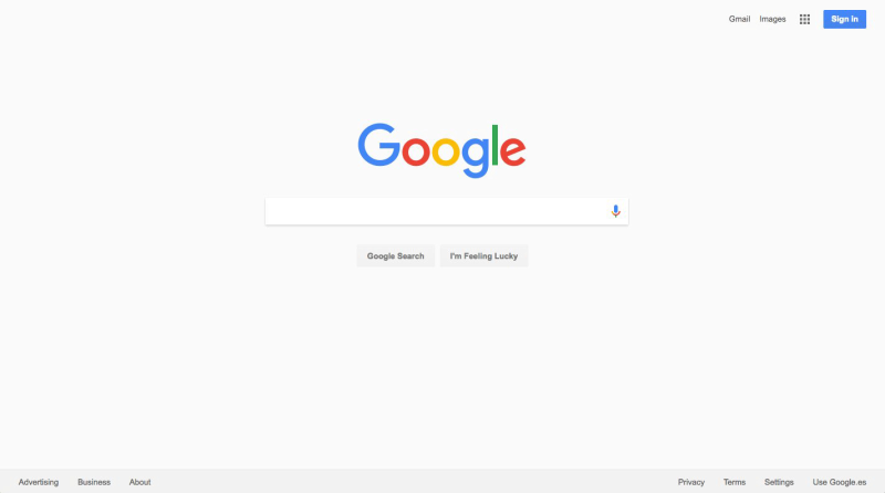
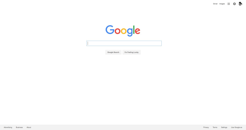
A couple of week ago, Google changed the look of their search platform, when they introduced a grey color background for their homepage, instead of older white background. Now the search box is slightly larger than the older one with more space.
Check with the screen shot:
The white background version that users utilized so far:
Yahoo search bar test
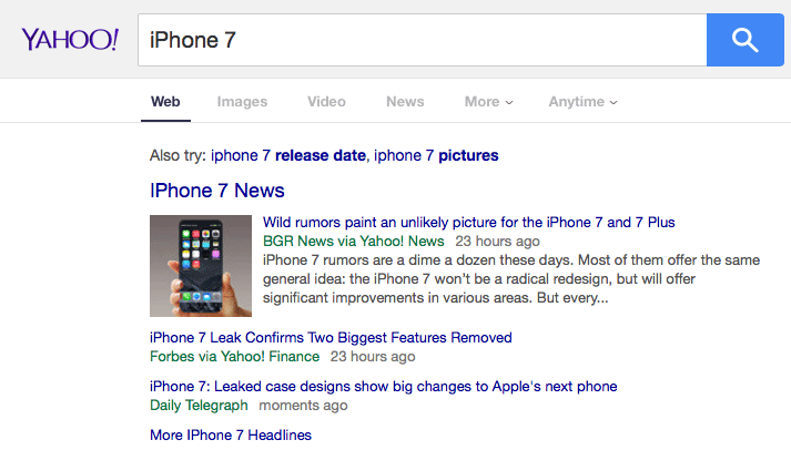
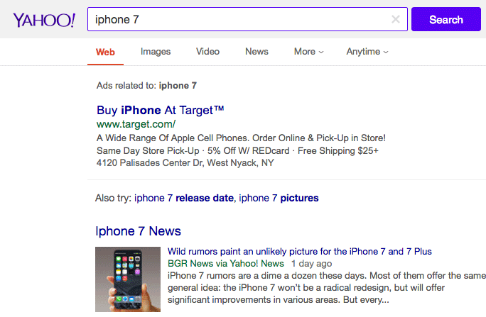
Simultaneously, Yahoo is also playing with their user interface and currently they are testing a new search bar on the top of the page. The new bar is more spacious and larger than the older. The purple color drop out of the search box has been replaced with the magnifying glass icon.
Here is the screen shot:
The version that was live so far:
